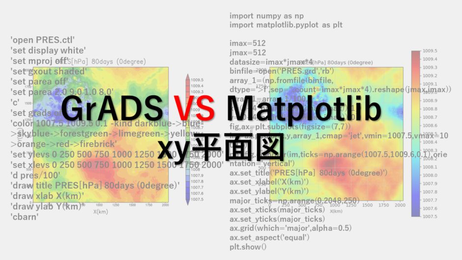

3次元データである高度のx,y平面図をGrADSとMatplotlibそれぞれで描画したいと思います。
使用データ
512×512×75のビックエンディアンバイナリーデータ:PRES.grd
GrADS用のコントロールファイル:PRES.ctl
GrADSの場合
'open PRES.ctl'
'set display white'
'set mproj off'
'set gxout shaded'
'set parea off'
'set parea 2.0 9.0 1.0 8.0'
'c'
'set grads off'
'color 1007.5 1009.5 0.1 -kind darkblue->blue->skyblue->forestgreen->limegreen->yellow->orange->red->firebrick'
'set ylevs 0 250 500 750 1000 1250 1500 1750 2000'
'set xlevs 0 250 500 750 1000 1250 1500 1750 2000'
'd pres/100'
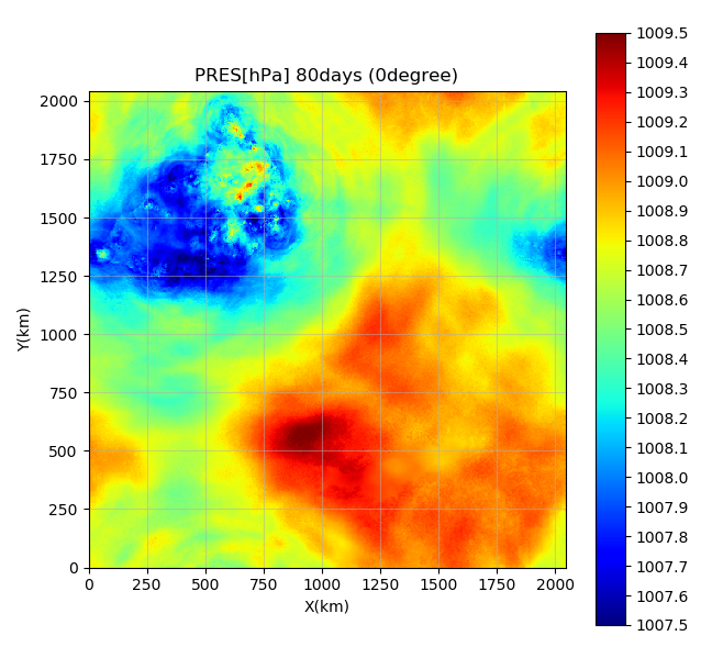
'draw title PRES[hPa] 80days (0degree)'
'draw xlab X(km)'
'draw ylab Y(km)'
'cbarn'

Matplotlibの場合
import numpy as np
import matplotlib.pyplot as plt

imax=512
jmax=512
datasize=imax*jmax*4
binfile=open('PRES.grd','rb')
array_1=(np.fromfile(binfile, dtype='>f',sep='',count=imax*jmax*4).reshape(jmax,imax))
array_1=array_1/100.0
x=(0+4*np.indices((jmax,imax))[1])
y=(0+4*np.indices((imax,jmax))[0])
fig,ax=plt.subplots(figsize=(7,7))
im=ax.pcolor(x,y,array_1,cmap='jet',vmin=1007.5,vmax=1009.5)
pp=fig.colorbar(im,ticks=np.arange(1007.5,1009.6,0.1),orientation='vertical')
ax.set_title('PRES[hPa] 80days (0degree)')
ax.set_xlabel('X(km)')
ax.set_ylabel('Y(km)')
major_ticks=np.arange(0,2048,250)
ax.set_xticks(major_ticks)
ax.set_yticks(major_ticks)
ax.grid(which='major',alpha=0.5)
ax.set_aspect('equal')
plt.show()
まとめ
スクリプトの量は、GrADSの方が少ないです。このぐらいの差ならないといっても良いかもしれませんが…
しかし、GrADSの場合、コントロールファイルを作らないといけないので、その行程を含めるとどっちが簡単に描画できるか微妙です。
また、GrADSは色数が少なく、きれいではないということで、こちらのスクリプトを入れています。